
Article: How to Choose Hand-Painted Abstract Art for Your Living Room

How to Choose Hand-Painted Abstract Art for Your Living Room
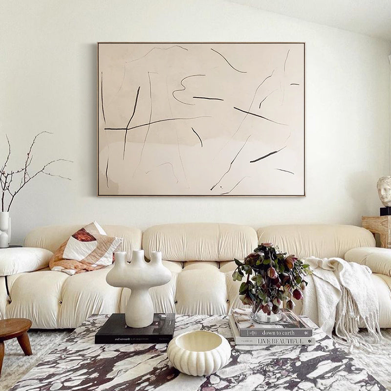
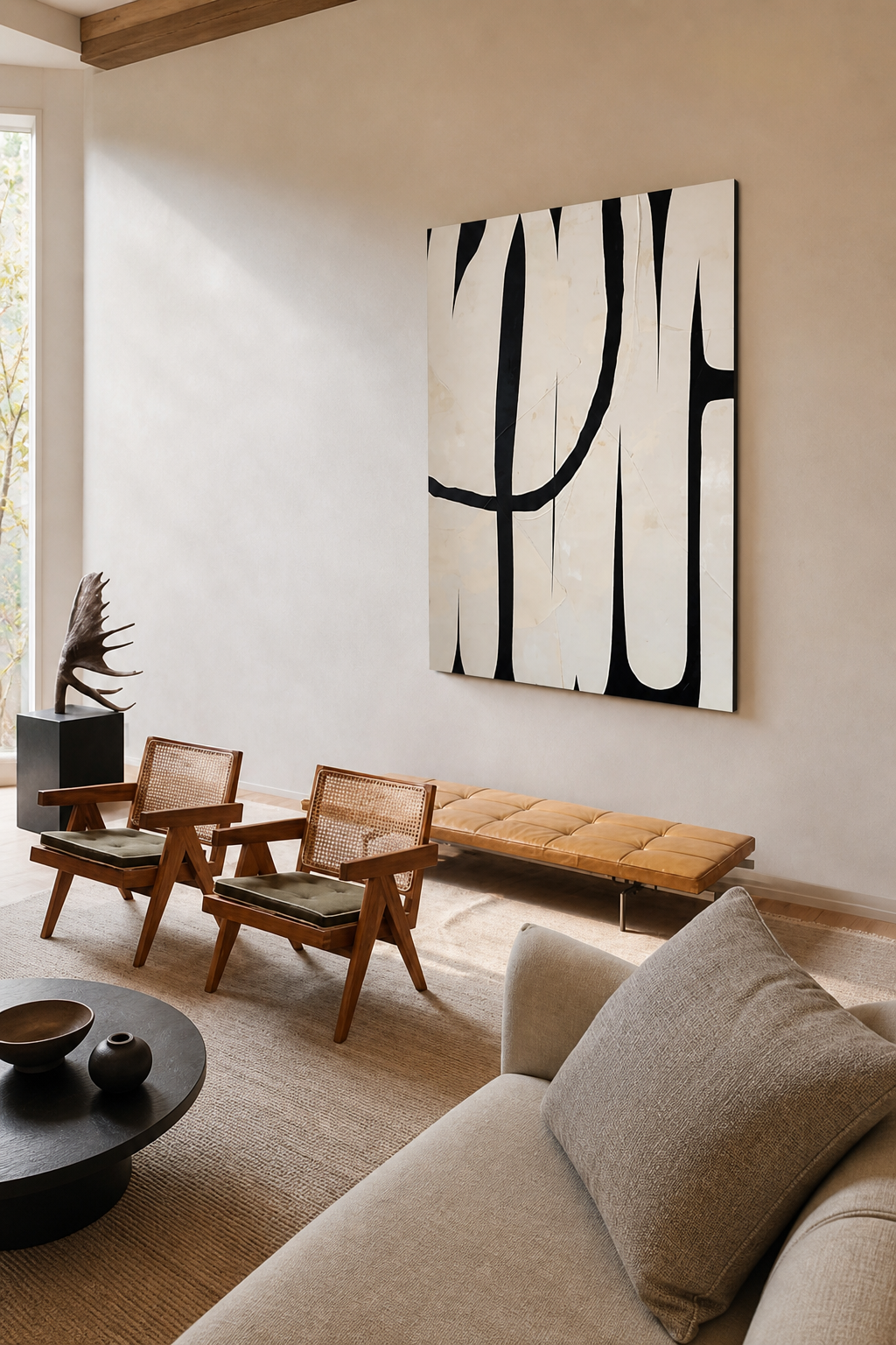
Choosing abstract art for a living room is less about matching every color perfectly and more about creating the right balance of scale, mood, texture, and visual weight. A well-chosen painting can make the room feel finished, connect furniture and textiles, and give the space a focal point that feels personal.
This guide explains how to select hand-painted abstract art for your living room, from measuring the wall to choosing a palette and finish.
1. Start with the wall, not the painting
Before comparing styles, measure the usable wall area. Note the width above the sofa, console, fireplace, or cabinet, then account for nearby windows, lamps, and shelving. Art should feel visually connected to the furniture below it rather than floating alone on a large wall.
As a practical starting point, choose artwork that fills roughly one-half to two-thirds of the furniture width beneath it. This is a flexible design guideline rather than a strict rule. A single oversized canvas creates a calm, gallery-like focal point, while a smaller piece leaves more negative space for an airy, minimalist look.

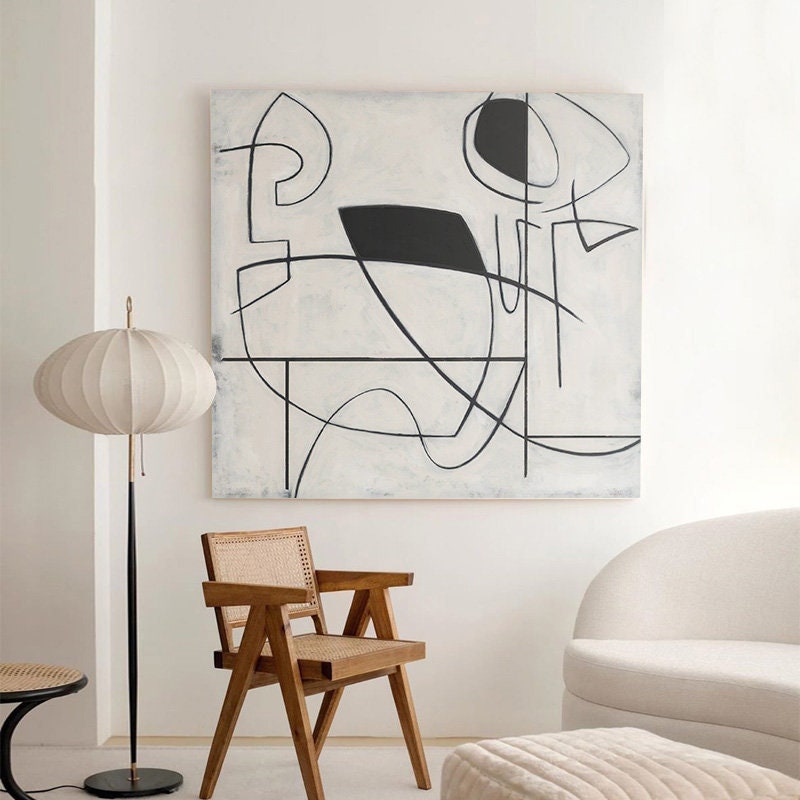
A neutral grey-and-white painting can anchor a room without overwhelming a quiet palette.
2. Choose a palette that supports the room
You do not need to copy the exact colors of your sofa, rug, and curtains. Instead, look for one or two tones in the painting that relate to the room, then allow the remaining colors to introduce contrast.
- Warm neutral rooms: consider cream, beige, taupe, sand, soft brown, or muted terracotta.
- Cool contemporary rooms: try pale blue, misty grey, white, charcoal, or restrained green.
- Mostly white interiors: use texture and subtle tonal variation to add depth without losing the light feeling.
- Colorful spaces: repeat one existing accent color and let the painting bring in a second, quieter supporting tone.
If your room already has several strong patterns, a restrained minimalist painting can provide visual breathing room. If the furniture is simple, a more expressive composition can become the main point of interest.
3. Consider orientation and furniture proportions
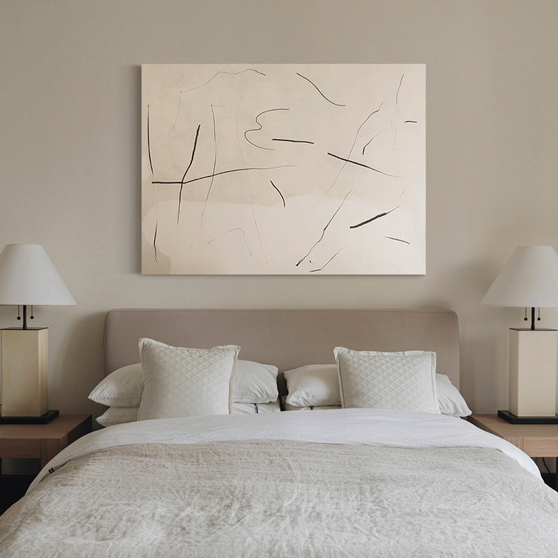
Horizontal paintings work naturally above sofas, beds, consoles, and long cabinets because they follow the furniture’s width. Vertical artwork can emphasize ceiling height and is often effective on narrow walls, beside windows, or in reading corners. Square canvases feel balanced and work well when the surrounding architecture is symmetrical.
For an open-plan living room, view the wall from the main entrance and from the seating area. The best orientation is the one that feels balanced from both positions.

Soft blue landscape-inspired art adds a calm focal point and works especially well with light wood, cream upholstery, and natural textiles.
4. Think about texture and changing light
Hand-painted artwork responds to light differently from a flat print. Brushwork and layered paint create small highlights and shadows that change throughout the day. Before choosing a highly textured piece, consider how daylight and lamps reach the wall.
Soft side lighting often reveals texture beautifully. Strong direct sunlight can create glare and may affect materials over time, so avoid placing original artwork where it receives prolonged, intense sun. In darker rooms, a picture light or nearby wall light can help the surface detail remain visible in the evening.
5. Select a frame and finish that suit the space
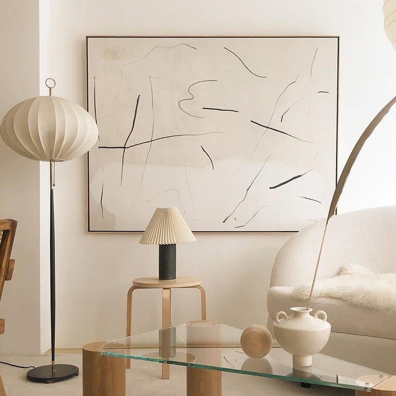
The frame should support the painting, not compete with it. Natural wood brings warmth, black creates a crisp architectural edge, and light neutral frames blend easily into relaxed interiors. An unframed or gallery-wrapped canvas offers a clean contemporary appearance.
When selecting a finish, consider the other materials in the room. A black frame can echo dark metal lighting or table legs; a light wood frame can connect with oak furniture and woven textures. Repeating one material is often enough to make the artwork feel intentional.
6. Choose art for the feeling you want
Abstract art does not need to represent a specific scene to shape the atmosphere of a room. Broad quiet forms can feel restful, directional marks can add movement, and organic shapes can soften a space with many straight architectural lines.
Ask yourself how you want the living room to feel: calm, energetic, warm, airy, grounded, or dramatic. Then use that word as a filter. It is usually more helpful than trying to match a named style exactly.

Organic floral forms can soften a modern room while keeping the overall palette sophisticated and understated.
7. Hang the painting at a comfortable viewing height
For most living rooms, the center of the artwork should sit near eye level. When hanging art above a sofa or console, leave enough space for the two elements to read as a group. If the gap is too large, the painting may look disconnected from the furniture.
Use removable paper templates or painter’s tape to test the dimensions before drilling. Step back to view the arrangement from several angles, including the room entrance and the main seating position.
Why choose hand-painted canvas art?
A hand-painted canvas has real surface variation: layered color, individual brush marks, and texture that can be seen from different angles. Those physical details make each piece feel more connected to the room. For buyers who value craftsmanship and material presence, original hand-painted art offers an experience that a flat reproduction cannot fully duplicate.
At ArtopiaPainting, our collection focuses on hand-painted canvas art for modern interiors, with options suited to neutral, minimalist, abstract, floral, and landscape-inspired spaces.
Frequently asked questions
Should living room art match the sofa?
It can relate to the sofa through one shared color or through a similar warm or cool undertone, but it does not need to match exactly. A little contrast often makes the room feel more considered.
Is one large painting better than several small pieces?
One large painting creates a strong, uncluttered focal point. Several smaller pieces allow more variety but require careful spacing and a consistent visual relationship. The better choice depends on the wall, furniture proportions, and the atmosphere you want.
What colors make a living room feel calm?
Soft whites, muted blues, warm greys, beige, pale green, and gentle earth tones often create a calm impression. Texture and composition matter too: spacious layouts and quieter brushwork can feel more restful than dense, high-contrast designs.
Find the right painting for your space
Start with the wall measurements, decide on the mood, and shortlist pieces that feel balanced with your furniture. Explore our best-selling hand-painted art, browse blue canvas paintings, or discover more floral wall art for your living room.
Read more
How to Choose the Right Size Wall Art for Your Living Room
A practical guide to choosing wall art size for a sofa, console, or feature wall, with measurements, hanging tips, and hand-painted art ideas.
Read more